Pathfinder Core PRO allows you to create your own custom user interface that can be displayed and used in a web browser on any device. This allows you to define precisely how your users interact with your Axia system in a way that supports your organization's workflow. Currently, Google Chrome is the recommended browser for this feature.
The User Panels List
HTML User Panels may be used and edited from the Automation > User Panels menu item. The page has two lists, Panels and Themes.
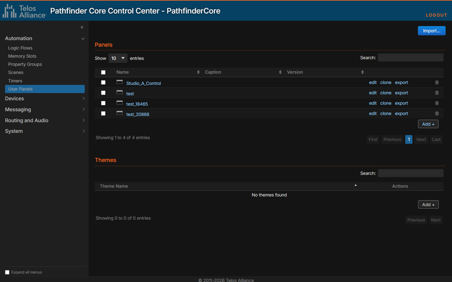
In the Panels list:
HTML5 Panels are displayed as links. Clicking that link will display the Panel within the context of the Pathfinder Core PRO web pages. Click the panel icon beside the name to open the Panel in its own window without most of the browser menu systems.
Click the edit link to open the Panel in the Panel Designer.
Clicking the clone link will make a duplicate of the Panel as it exists under a new Panel name.
Click export to download the panel as a
.pcpexportfile, which carries its pages, images and the custom themes it uses. Use Import... at the top of the page to load an exported panel into this or another system.Click the trash icon to delete a Panel.
Tick the check boxes to select several panels, then use Clone Selected or Delete Selected in the toolbar that appears.
Click Add + to open the Panel Designer and create a new Panel.
The Themes list holds custom themes, which are described in Themes. Each theme has edit, clone and export links and a delete icon, and Add + creates a new theme.
Important Note: Panels built in version 1.x open and work in 2.0, but a panel saved in 2.0 cannot be opened by a 1.x system. Keep an export of the 1.x version if you may need to return to it.
The Panels list also includes legacy Panels created with the legacy Panel designer; these can only be removed. See Legacy User Panels.
The Panel Designer
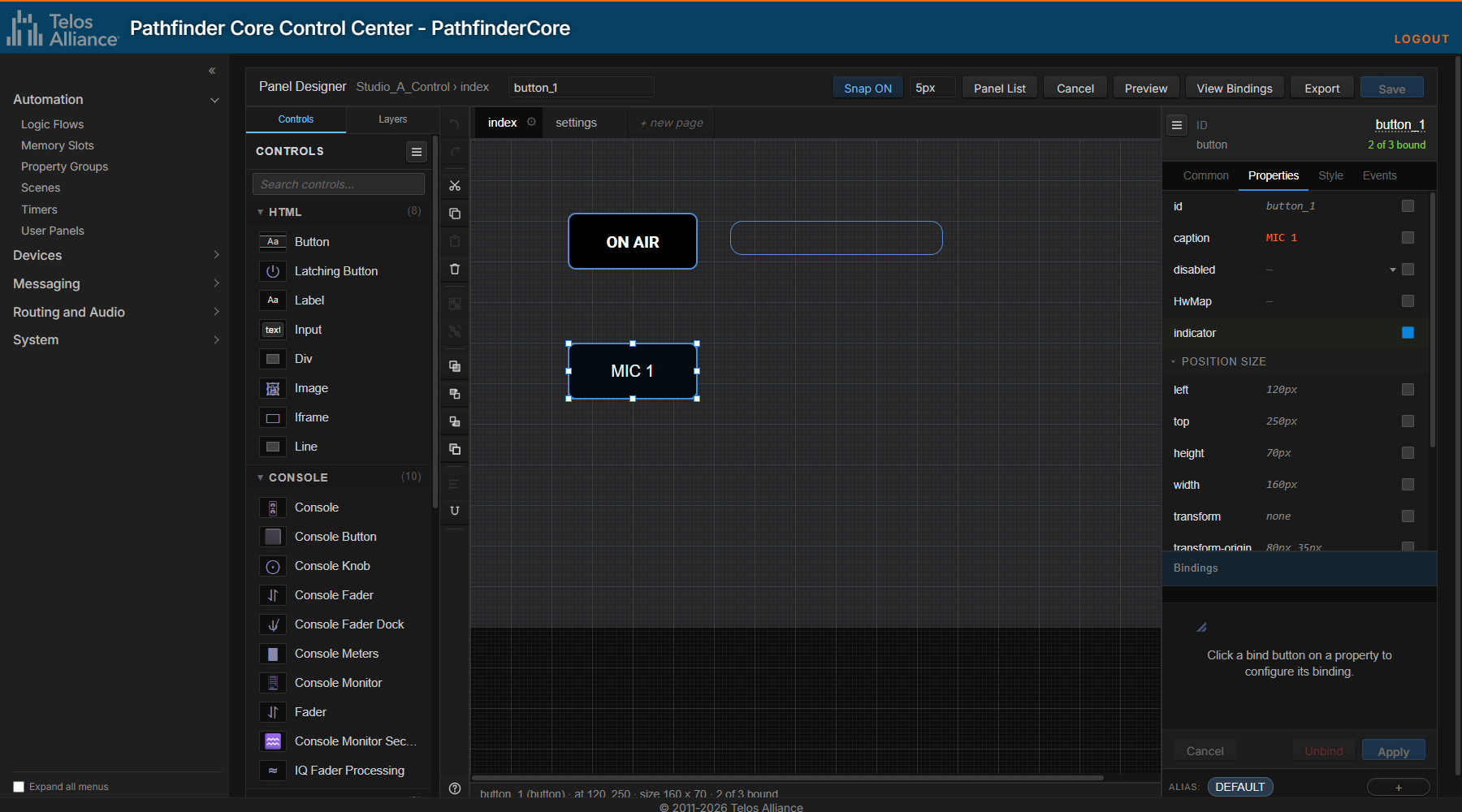
The Panel Designer has these parts:
Part | Where | What it is for |
|---|---|---|
Toolbar | Top | The panel and page you are editing, Select element... to jump to a control by name, the unsaved-changes indicator, Snap ON/OFF and the snap grid size, Panel List, Cancel, Preview, View Bindings, Export and Save. |
Controls and Layers | Left | Controls is the palette of controls you can add, grouped by category, with a search box. Layers lists the panel's layers and the controls on them. |
Action rail | Beside the palette | Undo and redo, cut, copy, paste and delete, group and ungroup, stacking order, Align and distribute, size matching, and the keyboard shortcut list. |
Canvas and page tabs | Center | The page you are designing, with a tab for each page above it. |
Inspector | Right | The selected control's properties, on the Common, Properties, Style and Events tabs, with the Bindings drawer below them and the ALIAS strip at the bottom. |
The status line under the canvas shows the selected control's name, type, position, size and how many of its properties are bound.
Creating a New Panel
Click Add + to create a new Panel and open the new Panel in the Panel Designer.
Click Save and type a name for your Panel to instantiate it before you begin adding components.
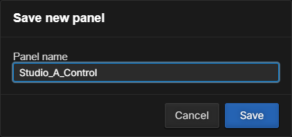
After saving and giving the Panel a name, the name of the Panel should appear at the top of the designer.
Selecting a Theme
User panel components in their default state will look differently depending on the theme selected for the panel. There are two themes available: light and dark; new panels start on the dark theme. To select a theme, click an empty part of the page so that the page itself is selected, open the Style tab in the Inspector, and change theme.
It is important to note that existing panels may require some adjustment when changing to the new theme. In particular, styles which you have overridden with your own settings will retain your choices which may or may not be appropriate to the new style. In the Component Reference we may display either dark or light theme, but the same components will work with either and will be styled accordingly.
You can also apply a custom theme on top of the light or dark theme; see Themes.
Page Settings
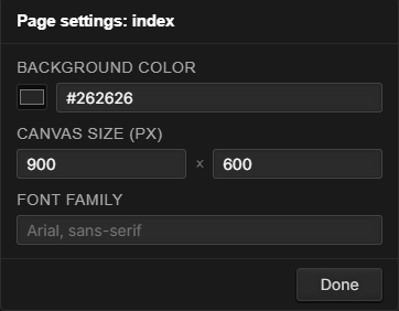
Click the gear icon on a page's tab to open its settings:
Setting | Description |
|---|---|
Background color | The page's background color. |
Canvas size (px) | The page's width and height in pixels. |
Font family | The default font for text on the page. |
Adding Controls
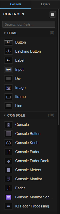
To add components to your Panel, drag them from the Controls palette onto the page. Type in Search controls... to find one quickly.
The dropped control is selected, with handles at its corners and edges:
To resize the component, drag a handle. Hold Shift while dragging to keep its proportions.
To move the component within the Panel, click and drag the center of the component. With Snap ON, it snaps to the grid; hold Alt while dragging to move it freely.
You can also use the arrow keys on your keyboard to nudge the selected component in any direction. Each press of an arrow key will move the component one pixel at a time.
Click Select element... on the toolbar and choose a control by name to select it, which is useful on a crowded page.
Adjusting Properties
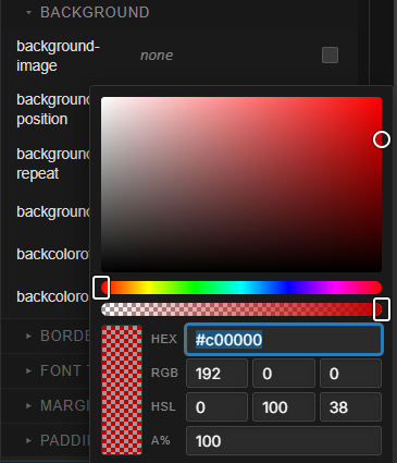
The Inspector on the right will update to include properties that may be adjusted for the currently selected component type. The Properties tab holds the control's own properties, such as a button's caption, and its position and size; the Style tab holds its CSS styling, in sections such as Background, Border and Font Text; and the Events tab lists the events the control raises, such as mousedown. Clicking in a field and changing the property will make the corresponding change to the component. Color values open a color picker, where you can also type a HEX value:
Click the control's ID at the top of the Inspector to rename it.
When several controls are selected, the Inspector shows the properties they have in common, and a change applies to all of them.
SHIFT Editing the Property List
Holding the SHIFT key while clicking in the User Panel property editor fields will bypass the usual helper dialogs and allow direct editing of the text. This can be useful for things like copying and pasting color values.
Undo and Saving
Use Undo and Redo on the action rail, or Ctrl+Z and Ctrl+Shift+Z, to step through your changes, including moves. The Cancel and Save buttons may be used to save your work or cancel pending changes and reload from the last save point. The toolbar shows unsaved changes while there is anything to save.
The designer also keeps an automatic copy of your work. If the browser closes before you save, the designer offers to recover the unsaved changes the next time you open the panel, and it warns you if you try to leave the page with unsaved changes.
Arranging Controls
Right-Click Menu
Right-click a control for the most common commands:
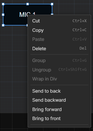
Command | Description |
|---|---|
Cut, Copy, Paste, Delete | These are the standard Cut, Copy, Paste and Delete tools. You can select multiple components by holding the SHIFT or CTRL key while you click additional components, or by dragging across an empty part of the page. |
Group, Ungroup | Groups the selected controls so they are selected and moved together, or ungroups them. |
Wrap in Div | Puts the selected controls inside a new Div control. |
Move to layer | Moves the selected controls to another layer. |
Send to back, Send backward, Bring forward, Bring to front | Changes which controls are drawn on top. |
Align and Distribute
Select two or more controls and click Align and distribute on the action rail:
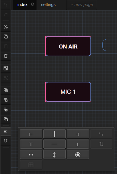
Row | Commands |
|---|---|
First | Align left edges, horizontal centers or right edges; distribute horizontally (three or more controls). |
Second | Align top edges, vertical centers or bottom edges; distribute vertically (three or more controls). |
Third | Match width, height, or width and height. |
Fourth | Tidy grid: equalize the rows and columns of the selected controls. |
The align and match commands use the last control you selected as the reference. For example, to line up four buttons with one that is already in the right place, select the other three first and that one last, then click Align top edges to last selected.
Size Matching
The size matching button on the action rail (the magnet-shaped icon) aligns and resizes items of like kind edge-to-edge. While it is on, if you drag a small button so its edge meets a large button, the small button will immediately snap to the size of the large button and align itself to the large button's edge. This is extremely useful when trying to build a Panel with many same sized components lined up edge to edge. However, it can also be disconcerting when you want the components to be different sizes and/or not to line up; click the button to turn it off.
Snap
If enabled, Snap ON on the toolbar aligns a component's location and size according to a grid of a specified pixel density, set in the box beside it. For example, if you enable snap with a pixel density of 10 pixels, you will notice that dragging components will jump by 10 pixels. This is useful when trying to evenly align components. Click it to turn snap off, or hold Alt while dragging to ignore it for one move.
Layers
The Layers tab lists the panel's layers and the controls on each:
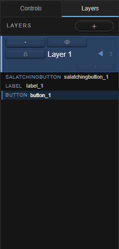
Click + to add a layer. New controls are added to the active layer.
Use a layer's buttons to hide it or lock it while you work on the others, to move it up or down, or to remove it.
Double-click a layer's name to rename it.
To move controls to another layer, right-click them and choose Move to layer.
Keyboard Shortcuts
Click the ? at the bottom of the action rail for the full list. The most useful are:
Action | Keys |
|---|---|
Add to selection | Shift+Click |
Toggle selection | Ctrl+Click |
Lasso select | Drag across an empty area |
Clear selection | Esc, or click an empty area |
Cut, Copy, Paste | Ctrl+X, Ctrl+C, Ctrl+V |
Delete | Del or Backspace |
Undo, Redo | Ctrl+Z, Ctrl+Shift+Z (or Ctrl+Y) |
Save | Ctrl+S |
Nudge 1 pixel | Arrow keys |
Drag without snap | Hold Alt |
Resize keeping proportions | Hold Shift |
Cancel a drag or resize | Esc |
Group, Ungroup | Ctrl+G, Ctrl+Shift+G |
Rename a control | Click its ID in the Inspector |
Rename a page | Double-click its tab |
Pages
Each Panel has an index page which is the default page that will be loaded when the Panel is first displayed, but additional Pages may be created. To design a new Page, click + new page after the page tabs:
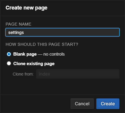
Type a name, choose whether the page starts blank or as a clone of an existing page, and click Create. A tab is added for the new page.
If a Panel has multiple pages, click a tab to select the page to edit.
Double-click a tab to rename the page.
Click the × on a tab to delete that page. You cannot delete the default index page.
Click the gear on a tab for the page's settings; see Page Settings.
Once multiple pages have been created you can use the change property along with buttons or property changes that will switch from one page to another. This is described in Changing Pages.
Binding Properties to the System
Bind Buttons
Each property and event in the Inspector has a check box at the end of its row. This is called a bind button. The bind button defines the properties that should be exposed to Pathfinder Core PRO for use in Logic Flows. In some cases, there may be hundreds of properties for a given component, but there are only a few that you will want to dynamically change while the Panel is running. For example, once you position a button on a Panel and size it to the size you desire, it is unlikely that you will want that position to change while your end-user is using the Panel. Therefore, there is really no need for the left and top properties to be cluttering up the Logic Flow tree.
The count at the top of the Inspector, such as 2 of 3 bound, shows how many of the control's exposed properties are bound to something.
The Bindings Drawer
Ticking a bind button opens the Bindings drawer at the bottom of the Inspector. This is a simple shortcut that allows you to generate a simple flow to bind values to the property without having to switch over to the Logic Flow designer. In addition, since these flows simply bind system states to Panel properties, the flows generated by this method do not count against your license count. It is an easy way to quickly add simple functionality. But it will be easier to understand with an example.
Say we want a button to toggle the OnAirLatch latching memory slot each time it is pressed.
Select the button, open the Events tab and enable the bind button on the mousedown event. We are defining what we want to happen when the button is pressed.
In the Bindings drawer, click Click to choose a binding target. The Property Selector used in Logic Flows opens.
Expand Memory, then LatchingMemorySlot#OnAirLatch, and select its Trigger property.
The Translator Properties dialog opens. Select the *=* entry and choose True on the left and True on the right, then click Done.
The drawer now shows the partial flow for the event. With an event, the start point is not displayed in the flow because the event we have selected is the start point and the end point is what we are going to change.
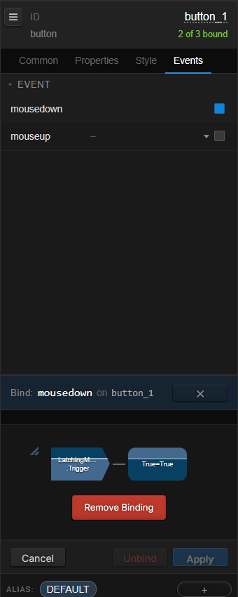
When you finish binding a button's mousedown (or its indicator), the designer offers to bind the other one too:
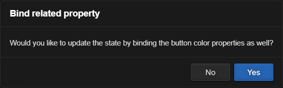
This message will only appear if you are generating flows on the mousedown or indicator properties of a button. In this case, it knows that since we are defining what we want the button to do, we probably also want some indication on the button that the requested action has been done. Click Yes to turn the bind button on for the indicator property. It is important to notice that the flow for the indicator property looks different than the one for the event. Standard properties like the indicator are changed based on things that are changing in the system, so the partial flow shows the start point and the translation, and the endpoint is the property of the Panel component we have selected. The rule of thumb is that events will display partial flows with an endpoint and other properties will display a flow with a start point. The missing part of the flow is the event or the property itself.
For this example, the indicator should follow the slot's SlotValue, with the translations True=ON and *=OFF. If the designer has filled in a different Start Point, click the Start Point in the drawer, or remove the binding and bind the property again, and choose SlotValue.
Click Save.
Saving the Panel will cause the flows to be created and start working in Logic Flows. Flows created in this manner will be generated in a special View in Logic Flows called _panels. The flows in this View may be monitored for troubleshooting purposes but they cannot be changed from within Logic Flows. They are only edited through the Panel designer. Use Remove Binding in the drawer to remove a binding.
To extend the example, select a Label, tick the bind button for textContent on the Properties tab, and choose a memory slot's SlotValue with a *=* translation. The label then shows the slot's value.
The running panel shows the result. Here the label shows the Greeting memory slot:
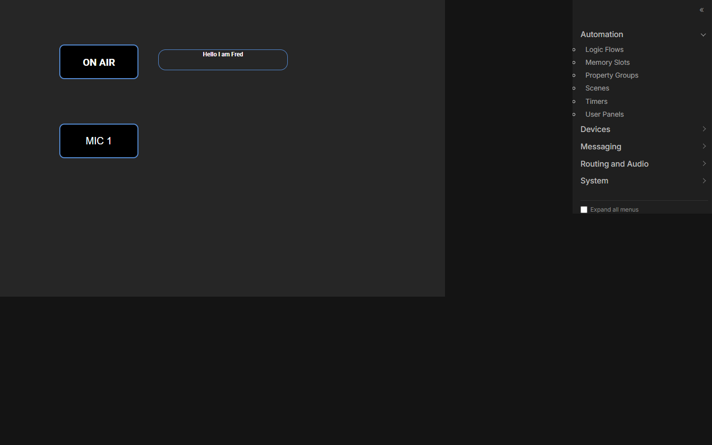
Note: To see these flows working you need to go back to User Panels and open the Panel for usage by clicking on the Panel link rather than the edit link (or click Preview in the designer, which opens it in its own window). It is helpful to have this open in a separate browser tab while you are working. Then, after saving changes in the designer, you can switch over to the tab with the running Panel, refresh the page, and see your changes in action.
Viewing All Bindings
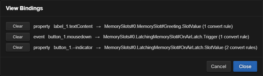
Click View Bindings on the toolbar to see every binding on the page, what it is bound to and how many translation rules it has. Click Clear to remove a binding.
Making a Button Latching
A common need is a button that toggles something on and off with each press, and lights while it is on. The designer can set this up for you:
When you drop a Button or Console Button onto a page, a small menu opens beside it: Make latching, or Keep momentary.
For an existing button, right-click it and choose Make latching.
Make latching creates a persistent latching memory slot named after the button (lms_<button id>, with _2, _3 and so on added if the name is taken), binds the button's press to the slot's Trigger, and binds the button's indicator to the slot's SlotValue. This is all one step, so a single Undo removes it. Latching memory slots are described in the Memory Slots and Logic Flows chapters.
The Latching Button control in the palette is different: it stays down until it is pressed again by itself, and raises latched and unlatched events.
Complex Panel Flows
In many cases you may wish to create more complex flows than described in the examples above. For example, you may want your indicator state on a button to be the product of numerous conditions in the system. These kinds of Flows can still easily be created but must be created within the Logic Flows designer.
Simply enable the bind button for the properties these Flows need to manipulate without generating a Flow in the designer. Save the Panel and then from within the Logic Flows property selector, these properties will be available for use under UserPanels.
Aliases
An alias is an alternative set of bindings for a control. For example, a page of five buttons can control five GPIOs on one alias and five different GPIOs on another, so the same buttons can serve several purposes.
The ALIAS strip at the bottom of the Inspector lists the selected control's aliases. DEFAULT is the control's normal set of bindings.

Click + to add an alias. Give it a name and choose which existing alias to copy from, then click Create.
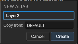
Click an alias to select it. The Inspector then shows and edits that alias's bindings.
Right-click an alias to Rename or Remove it, or to Copy bindings from another alias.
The control's alias property selects which alias is active while the panel runs. Bind it, for example, to a numeric memory slot with a looping range, translated to the alias names, and use another button to step through them.
Get the DEFAULT alias working first, including its bindings and hardware mapping, before adding aliases; the new aliases then start close to what you want, and you only change the differences. A control and all of its aliases are always mapped to the same hardware button.
Themes
A custom theme is a set of styles, layered on top of the light or dark theme, that you can apply to any number of panels. Use themes to give all of your panels a consistent look.
To create a theme, click Add + in the Themes list. The Theme Designer opens; it works like the Panel Designer, and a new theme starts on the dark theme. Style controls the way you want them to look, then Save the theme under a name.
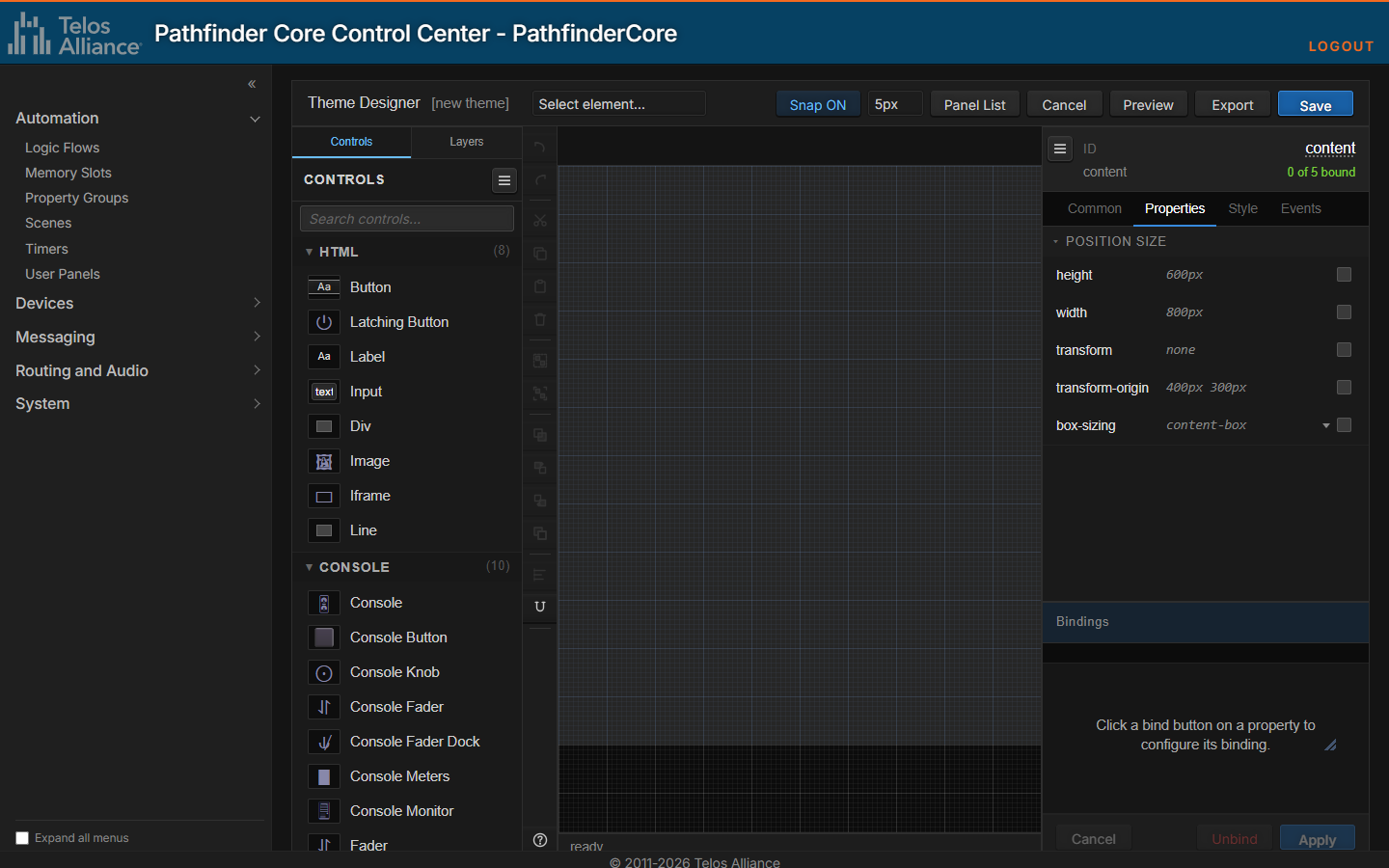
To use a theme, select the page in the Panel Designer, open the Style tab and choose the theme in Custom theme. Themes travel with a panel when it is exported.
Launching the Panel from a Desktop Icon (Windows)
If you are using Google Chrome, there are some command line options that will allow you to launch a Pathfinder Core PRO Panel as if it was an application. Copy and paste the following into a notepad or text editor:
"C:\Program Files (x86)\Google\Chrome\Application\chrome.exe" --app="data:text/HTML,<HTML><body><script>window.location='http://[Username:Password]@[IPAddress]/userpanelframemin.php?panel=[ttt]&page=[index]';</script></body></HTML>"When copied, this should be one line in the editor. The quotes at the beginning and end are part of the text so do not remove them. After the word “location” there is an http link.
Change [Username:Password] to match the credentials used in your system.
Change [IPAddress] to match the IP address of your Pathfinder Core PRO.
Change [ttt] to the name of the Panel you want to launch.
Change [index] if you want to target a page other than the default index page.
For example, these values…
[Username:Password] = Admin:Admin
[IPAddress] = 172.16.1.56
[ttt] = YAPanel
[index] = Its_a_New_Page
…would result in a shortcut like this:
"C:\Program Files (x86)\Google\Chrome\Application\chrome.exe" --app="data:text/HTML,<HTML><body><script>window.location='http://Admin:Admin@172.16.1.56/userpanelframemin.php?panel=YAPanel&page=Its_a_New_Page';</script></body></HTML>"Once you have the edits made, select the entire text again and copy it to your clipboard.
Right-click on your desktop and create a new shortcut using your edited shortcut text. Double-clicking on the shortcut should now launch the Panel as its own application.
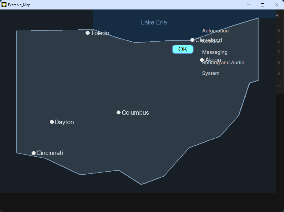
If you always want the Panel to launch in the same place on the screen you can add another option: window.moveTo(580,240). For example:
"C:\Program Files (x86)\Google\Chrome\Application\chrome.exe" --app="data:text/HTML,<HTML><body><script> window.moveTo(580,240); window.location='http://Admin:Admin@172.16.1.220/userpanelframemin.php?panel=ttt&page=index';</script></body></HTML>"In the future, we will investigate a way to generate the shortcut (or at least the shortcut text) automatically.
Component Reference
Each component has many available CSS properties and component events. Many of these properties can be understood after some basic study that starts with a basic internet search for CSS property descriptions.
This section will describe each component, including custom properties beyond the standard CSS style properties.
We have included default images of the components below, but it is important to note that the CSS properties can be used to make the components look much different than the examples included below. Feel free to adjust border, color, and shadowing properties to achieve the design desired.
Important Note: Each component has an ID property allowing you to define a name for the component. This is useful in differentiating components in Logic Flows and debugging so it is a good habit to name components as you create them. IDs must be unique within the page.
HTML Components
Button
The Button component can control and indicate changes in the system. In addition to standard CSS style attributes, customizable properties include:
Property | Function |
|---|---|
caption | Updates the inner HTML text of the button. |
hwmap | Used to select a hardware LCD button. This hardware LCD button will then mirror the behavior of the software button. See the Hardware Mapping Buttons topic below for more information. |
indicator | Used to set the button indication to ON, OFF, FLASH, SWAP and PULSE_0 through PULSE_10000. See the Button Indicator PULSE Values topic below for more information. |
backcoloron | Sets the button’s color when the indicator state is on. |
backcoloroff | Sets the button’s color when the indicator state is off. |
Wherever this button can be used, a Console Button could also be used. The difference is that the Console Button has a slightly more elegant look.
Buttons also support the CSS align-items property, which positions the caption when display is flex or grid, and the overflow and display properties, for example to show long captions with an ellipsis. A disabled button shows its disabled colors.
Latching Button
The Latching Button stays down when pressed and comes up when pressed again. In addition to standard CSS style attributes, its properties include:
Property | Function |
|---|---|
caption | The text on the button. |
latched | Whether the button is down (true) or up (false). |
Event | Function |
|---|---|
latched | Raised when the button is pressed down. |
unlatched | Raised when the button is released. |
To make an ordinary Button toggle something, see Making a Button Latching.
Label

Labels can be used to generate textual label information in the system. In addition to standard CSS style attributes, customizable properties include:
Property | Function |
|---|---|
textContent | Updates the inner HTML text of the label. Binding this property allows the label caption to be dynamically updated by Flows. |
Input
The Input control (called Input Box in earlier versions) allows user input. In addition to standard CSS style attributes, customizable properties include:
Property | Function |
|---|---|
value | Captured user input which can be applied to Logic Flows to make decisions and changes. |
type | Allows you to switch the input type between several different possibilities including text, number, color, etc. For example, if you drag an Input box onto a Panel and change the type to number and then fill in the min, max, and step properties, you will obtain an input box with a set of arrows for incrementing and decrementing the value property. |
In addition to mousedown and mouseup events, Input events include:
Event | Function |
|---|---|
change | The change event is raised when the user presses ENTER or moves out of the input field |
input | The input event is raised as the user makes changes/types. |
Both change and input events raise the current entered value.
To learn more about this feature visit: http://pathfinderpc.com/pfcorepro_downloads/panelinputboxes.mp4
Iframe
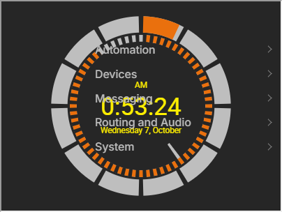
The Iframe control (called Web Page in earlier versions) is an HTML iframe which allows you to embed a web page from another site into the Panel. This component can be used to display video streams and other web page content.
In addition to standard CSS style attributes, customizable properties include:
Property | Function |
|---|---|
src | The url of the page to be displayed. |
If you intend to use this as a background component with other components on top, you may need to manually adjust the z-index property of this component or the overlaid components to get them to display properly.
The Iframe control includes this event:
Event | Function |
|---|---|
load | The load event cycles False when the frame starts to load and True when the loading is complete. |
Especially during testing, it is important to note that some sites (notably, Google) prevent their content from being displayed in an iframe.
Image
The Image component allows you to embed an image in a page. This component can be used to create background borders around a set of components.
Click the value of its src property to open the Select Image dialog, where you can upload an image to the panel and choose it (the dialog is shown in Changing Pages). Images you upload belong to the panel and are exported with it.
Before you use an image component, remember most elements also support the background-image property. For example, you can apply a background-image to the Panel itself or to buttons and labels.
Div and Line
A Div is a plain container. Use it as a background behind a group of controls, or right-click selected controls and choose Wrap in Div to put them inside one. A Line draws a straight line; drag its handles to set its length and angle.
Custom Components
The palette groups the custom controls as Console (Console, Console Button, Console Knob, Console Fader, Console Fader Dock, Console Meters, Console Monitor, Fader, Console Monitor Section, IQ Fader Processing), Meters (LED Meter, Gradient Meter, Gauge), Calendar (Calendar Resource Display), Clocks (Analog Clock, Analog Countdown, Digital Clock, Digital Countdown), Routing (Router XY Matrix, List Selector) and Memory (Local Panel Memory Slot).
Meters and Faders
HTML5 User Panels support two different kinds of meters (providing visualizations of Audio IOs that support metering) and two different kinds of faders (allowing gain manipulation of Audio IOs.)
Gradient Meter 
This component can be tied to Audio IOs that support metering in the system. See the Setting the IO Property topic in this chapter.
In addition to standard CSS style attributes, customizable properties include:
Property | Function |
|---|---|
IO | Used to select the audio IO this meter will display. |
orientation | Used to select whether the meter will display horizontally or vertically. |
meterscale | Used to select the scale of the meter. Options include standard, linear, and british. |
metrics | Used to define whether the numerical values for the meter are displayed next to the meter or not. Options include none, lefttop, middle, rightbottom. |
optimumpercent | Defines the optimum meter percentage. |
autosizefont | Used to define whether the metrics font will scale automatically as the size of the meter is adjusted. |
led>color | Properties used to adjust the on and off colors used for each of three sections of the meter. |
LED Meter 
This component can be tied to Audio IOs that support metering in the system. See the Setting the IO Property topic in this chapter.
In addition to standard CSS style attributes, customizable properties include:
Property | Function |
|---|---|
IO | Used to select the audio IO this meter will display. |
orientation | Used to select whether the meter will display horizontally or vertically. |
meterscale | Used to select the scale of the meter. Options include standard, linear, and british. |
metrics | Used to define whether the numerical values for the meter are displayed next to the meter or not. Options include none, lefttop, middle, rightbottom. |
autosizefont | Used to define whether the metrics font will scale automatically as the size of the meter is adjusted. |
led>color | Properties used to adjust the on and off colors used for each of three sections of the meter. |
led>border | Properties used to adjust the border settings of the individual LED blocks. |
Fader 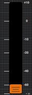
This component can be tied to Audio IOs that support gain manipulation. See the Setting the IO Property topic in this chapter. The Fader can also control non-audio control points. See the Setting the Control Property topic in this chapter.
The control displays the Fader value as you hover over the Fader. Fader values can be manipulated using the mouse wheel, dragging with the mouse, or touch and drag on a touch screen.
In addition to standard CSS style attributes, customizable properties include:
Property | Function |
|---|---|
IO | Used to select the Audio IO this meter will display. |
control | Adds support for LwCH options and Qor faders. See the Setting the Control Property topic in this chapter. |
metrics | Determines how the numbering for the fader is displayed. Options include none and lefttop. |
metricoffset | The percent of width used for the metrics. |
metriclinecolor | The color used for the lines drawn for each metric line. |
slider-height | The percentage of the overall component height used for the slider height. The greater the percentage, the taller the slider. |
slider-width | The percentage of the overall component width used for the slider width. The greater the percentage, the wider the slider. |
slider-opacity | Modifying this value will alter the opacity of the slider. Values can range between 0 (fully transparent) and 1 (fully opaque.) |
slider-background | This property changes the slider color. The property accepts gradient values: linear-gradient(#770000, #ff0000) or solid colors: #770000 |
slider-back-color | Primarily used for the simple and touch bar styles, this will set the background color of the simple slider or of the touchbar. Clicking this field opens the standard color picker dialog. Additional color properties are available for these slider styles allowing for a great deal of granularity. See below for details. |
slider-margin-left | The margin offset for the slider. |
slider-border-style | The slider border style. |
slider-border-width | The slider border width. |
slider-border-radius | The slider border radius. |
slider-border-color | The slider border color. |
slidebarwidth | The width in pixels of the bar on which the slider rides. |
slidebarcolor | The color of the bar on which the fader rides. |
slidebarradius | The radius in pixels of the bar on which the fader rides. |
slidebardisplay | Determines whether the slider bar is displayed. |
faderimage | Rather than using the default designed slider, an image may be used. |
optimum | The gain level which is designed to be optimum or unity. |
type | Options are audio, which provides the ability to control Audio IOs, and linear, which provides the ability to control numeric values rather than audio sources. See Setting the Control Property below. |
autosizefont | Determine whether the metric font automatically scales as the size of the fader is adjusted. |
faderstyle | Fader objects can have one of three different styles: default, simple, and touchbar. Default represents the same fader style as Pathfinder Core PRO has had previously. Simple turns the fader into a simple rectangle with rounded edges and an optional center line. Touchbar is designed for touch interfaces; in this variation dragging with your finger or mouse anywhere in the fader rectangle will cause the bar level to go up or down |
orientation | Options are vertical (the default), and horizontal. Currently, when you flip the orientation, the height and width values are retained, making for a squashed funky graphic. You can hold the SHIFT key while resizing the fader to stretch it into the correct size, or manually swap the width and height values in the property list and then clicking save in order to set the initial correct height to width scaling ratio. |
invert | Setting the invert property to true enables options to set the mouse, scroll wheel, and metric layouts to match changes in orientation. |
motioninvert | Once invert is set to true, motioninvert can be set to true to allow mouse and scroll wheel functions to move the Fader up and down regardless of the Fader’s orientation. Even if the Fader is upside-down for example, this property will allow mouse wheel up movements to increase the Fader value. Since Faders may be used to control other values instead of just audio, this opens up more of those possibilities. |
metrictextinvert | Once invert is set to true, metrictextinvert can be set to true to make the text upside down or right side up. It is also possible to turn the metrics off and use the Faders that way as well. |
Additional Default Fader style properties:
Property | Function |
|---|---|
slider-top-color | Adjusts the color of the top edge of the default fader style. Due to opacity blending, this can be a subtle change. |
slider-bottom-color | Adjusts the color of the bottom edge of the default fader style. Due to opacity blending, this can be a subtle change. |
slider-default-line0-color | Adjusts the color of the first line on the default fader. |
slider-default-line1-color | Adjusts the color of the second line on the default fader. |
slider-default-line2-color | Adjusts the color of the third line on the default fader. |
slider-default-line3-color | Adjusts the color of the fourth line on the default fader. |
slider-default-line4-color | Adjusts the color of the fifth line on the default fader. |
slider-default-line5-color | Adjusts the color of the sixth line on the default fader. |
slider-default-line6-color | Adjusts the color of the seventh line on the default fader. |
Additional Simple Fader style properties:
Property | Function |
|---|---|
slider-simple-line-color | Adjusts the color of the line on the simple fader style. |
slider-simple-line-display | Adjusts whether the line on the simple fader style is displayed or not. |
Console Fader 
This component can be tied to Audio IOs that support gain manipulation. See the Setting the IO Property topic in this chapter.
The control displays the Fader value as you hover over the Fader. Fader values can be manipulated using the mouse wheel.
The Console Fader is a smart fader capable of displaying different properties depending on the type of IO assigned to it.
In the example above, this Console Fader has been assigned to a Fusion console input. When loaded, the component updates the controls according to the type of IO to which it has been assigned. In this case it shows the name of the sourceprofile, a meter obtained from the input stage of the fader (see note below), the program buss assignments, a fader which maps to the Fusion fader, A and B user buttons, Talk and Preview buttons, and ON and OFF.
This component will dynamically adjust what it displays depending on the type of IO it is associated with. Those changes will only be shown when the Panel is executed. That is when the capabilities of the assigned IO are analyzed. For example, after dragging a console fader onto the Panel and assigning IOs, when the Panel is executed you may see controls that look like:
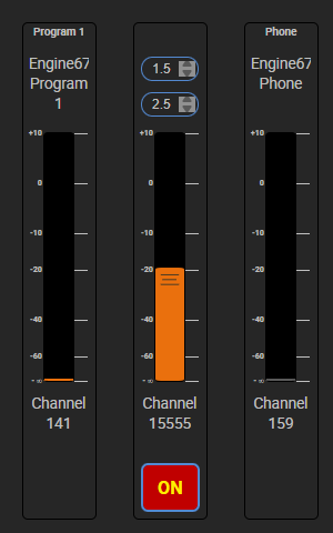
In this case the first and third faders are tied to sources on a Q engine (Program 1 and Phone). The second fader is tied to a VMIX channel input so the component changes to show the time up and down parameters.
Important Note: When the control property is used, metering will be deduced where possible unless the IO property is also filled in. If nothing is selected in the control property, the control point is inferred by the IO property where possible. For node Ios and Vmixers, the IO property is the recommended field to select. For console faders, the control property is recommended. Additionally, for iQx, Qor engine, and iQs style consoles, selecting a control point will use LwcpSs instead of Lwrp to obtain metering data.

Many of the properties discussed above in the Fader object have also been exposed in the Console Fader so that the color and style of the slider within the larger console fader object may be manipulated. These styles correspond directly to the styles.
In addition to standard CSS style attributes, customizable properties include:
Property | Function |
|---|---|
IO | Used to select the Audio IO this meter will display. |
control | Adds support for LwCH options and Qor faders. See the Setting the Control Property topic in this chapter. |
fader-slider-background | This property changes the slider color. The property accepts gradient values: linear-gradient(#770000, #ff0000) or solid colors: #770000 |
fader-slider-back-color | Primarily used for the simple and touch bar styles, this will set the background color of the simple slider or of the touchbar. Clicking this field opens the standard color picker dialog. Additional color properties are available for these slider styles allowing for a great deal of granularity. See below for details. |
optimum | The gain level which is designed to be optimum or unity. |
faderstyle | Fader objects can have one of three different styles: default, simple, and touchbar. Default represents the same fader style as Pathfinder Core PRO has had previously. Simple turns the fader into a simple rectangle with rounded edges and an optional center line. Touchbar is designed for touch interfaces. In this variation dragging with your finger or mouse anywhere in the fader rectangle will cause the bar level to go up or down |
menu-enabled | For iQs, Qor, and iQx style consoles, this option defines whether the menu button will be enabled; the menu button may be assigned to the eq and dynamics section, but could also be used for your own custom purposes as well |
meter-location | Whether the meter is located at the top of the fader in the label section or vertically along the right side of the fader |
Additional Default Fader style properties:
Property | Function |
|---|---|
fader-slider-top-color | Adjusts the color of the top edge of the default fader style. Due to opacity blending, this can be a subtle change. |
fader-slider-bottom-color | Adjusts the color of the bottom edge of the default fader style. Due to opacity blending, this can be a subtle change. |
fader-slider-default-line0-color | Adjusts the color of the first line on the default fader. |
fader-slider-default-line1-color | Adjusts the color of the second line on the default fader. |
fader-slider-default-line2-color | Adjusts the color of the third line on the default fader. |
fader-slider-default-line3-color | Adjusts the color of the fourth line on the default fader. |
fader-slider-default-line4-color | Adjusts the color of the fifth line on the default fader. |
fader-slider-default-line5-color | Adjusts the color of the sixth line on the default fader. |
fader-slider-default-line6-color | Adjusts the color of the seventh line on the default fader. |
Additional Simple Fader style properties:
Property | Function |
|---|---|
fader-slider-simple-line-color | Adjusts the color of the line on the simple fader style. |
fader-slider-simple-line-display | Adjusts whether the line on the simple fader style is displayed or not. |
Setting the IO Property
Meters and Faders may be tied to an Audio IO using the component's IO property. For example:
Drag a Gradient Meter into a User Panel and resize it to an appropriate size
Click the IO property to open the Select Audio I/O dialog box
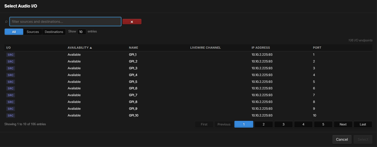
Choose All, Sources or Destinations to toggle between them; you can use the filter box to narrow down the list of available sources or destinations
Click an IO whose metering you want to be tied to the meter and click Select
The IO field will fill with the path of the selected IO
Since we are in the designer, no metering will be displayed. It will only display when the Panel is executed.
Important Note: Enabling the bind button for the IO parameter will make it available to Logic Flows, allowing you to dynamically change the IO assigned to the meter or fader.
Setting the Control Property
Faders and Console Faders may also be assigned to their control and metering points using the control property. This is recommended for control over physical mixer faders. It will intelligently deduce metering and control locations according to the console type and fader type selected.
To enable the control property of an existing Fader or Console Fader control:
With the Fader or Console Fader control selected, click the control field in the Inspector
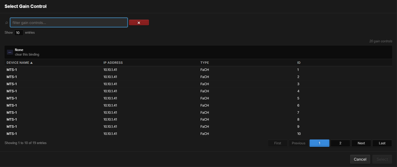
In the Select Gain Control dialog, click on the device to control and click Select
Controlling Other Properties
To control something other than a console fader, for example a memory slot or a GPIO pin, do not use the control property to bind the functionality and instead bind the slidervalue property and the slidervaluechanged event directly to properties. This can be useful in situations where a translation is necessary.
Set the slidervaluechanged event to the property the fader should change, with a translation from the fader's values to that property's values
Set the slidervalue property to the same property and reverse the translation. That will make sure that if something else changes the property that it will be updated in the fader
For this to work properly there are several other properties that can be used:
Property | Notes |
|---|---|
min | The minimum value allowable by the Fader. |
max | The maximum value allowable by the Fader. |
step | The steps that can be used for the change. A value of 1 would mean the value has to be integers whereas a step value of .1 would allow for a single decimal place in the values. |
Type | This property has two options: Audio: the scale of the fader will follow a typical audio fader where larger moves in the optimal range of the fader relate to smaller decibel changes. Linear: the scale is a direct linear scale. |
For example, we could connect a Fader to a GPIO value: set the min property to 0, the max property to 1, the step property to 1, and type to linear; set the slidervaluechanged event to the GPO PinState with 0 → Low and 1 → High, and set the slidervalue property to the same PinState with Low → 0 and High → 1. For this example, you may also want to turn the metrics off since there are only two valid states.
Important Note: When using the control property to select the functionality for the fader, the system will try to automatically set the min, max, and step properties if the system knows what they should be for the given control point.
This is probably not the best use case for this functionality, but it shows how you can use the Fader control to manipulate any value in the system either directly using the control property if it is a numeric property or via translation and the slidervalue and slidervaluechanged property and event.
Console Monitor
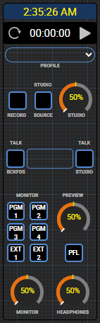
A monitor module for a console, like the one at the right of the Console component: clock and timer, show profile, record and talkback buttons, monitor and preview source selection, and studio, monitor and headphone level knobs. Bind its control property to a console in the same way as the Console Monitor Section below.
Console Knob

The rotary Console Knob may be used in the same way as the Fader above. The same properties for numeric and non-numeric control as well as min, max, step, etc. properties also apply to the console knob object.
This control can also have its control property used to select a console fader or other numeric property in the system to control in the same manner as described for the fader control above. In addition, this component also shares the indicator property with button objects so that the knob color may be changed based on some indication state.
Console Button

The ConsoleButton component can control and indicate changes in the system. This button works the same as the HTML button but has a more interesting look.
In addition to standard CSS style attributes, customizable properties include:
Property | Function |
|---|---|
saconsolebutton-caption | Updates the text displayed on the button. |
hwmap | Used to select a hardware LCD button. This hardware LCD button will then mirror the behavior of the software button. |
indicator | Used to set the button indication to On, Off, or Flash. The colors used for On, Off, and the two flash colors are the backcoloroff and on properties. |
backcoloron | Color used when the indicator state is on. |
backcoloroff | Color used when the indicator state is off. |
saconsolebutton-image | Used instead of the standard CSS style background image to update an image inside the button. Because this component is built from several embedded HTML objects, this makes sure the correct inner component displays the image. |
border-gradient | Options include complex and simple. A value of simple will remove the background top-to-bottom gradient. No value or a value of complex produces a button centered in a background. But as you resize this can cause the button to be off by a pixel one way or the other. At smaller sizes this can become an objectionable artifact. The simple design is just a button with a border and therefore the border scales more perfectly. Complex gradients have a slightly softer feel while the simple gradients scale better. |
Console Monitor Section
Note: Fusion consoles require version 3.2.1.28 of the Fusion software in order to properly use the monitoring section with these consoles. Please click here for a document on obtaining and installing updated Fusion software.
The Console Monitor Section acts as a monitor section for consoles. It is important to note that the clock and timer functionality are controlled by Pathfinder Core PRO and not the console and so will not be in sync with the console timer and countdown clock. This is because those control points are not currently available in the control protocols.
Dragging this component onto a Panel will present a monitor section for a console:
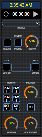
The picture above shows the monitor section in both default and dark themes as well as differences when attached to different types of consoles. The component will change its control layout when executing depending on the type of console it is attached to. For example, the monitor section shown in the center in the picture above is attached to an iQx, whereas the one on the right is attached to a Powerstation with Fusion console.
To assign the component to a specific console, select the component in the Panel and click the control property:

In the Select Gain Control dialog, you will find one control point for each Console; select the console you would like to associate with the monitor section and click Select
Important Note: The Fusion and Powerstation require version 3.2.1.28 of the Fusion software in order to properly use the monitoring section with these consoles.
iQ Fader Processing
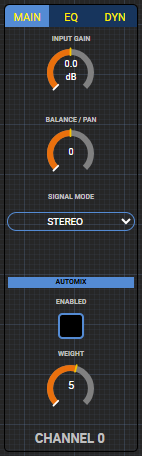
The iQ fader processing is a component that accesses the eq and dynamics section of Qor, iQx, and iQs faders. In order to use it, select the console from the control property and then assign a number 1 through 24 to the fader-number property to use it with a specific fader. This assignment can be automated using the menu button in the console fader object. Turn the binding of the fader-number property on. Then within each fader in the panel, use the menu assign and menu unassign event to assign the correct fader number to the component. A fader number of 0 can be used to make the component not have any effect. It is a good idea to hook the menu indicator to the eq/dynamics section fader-assign property as well so the menu button will only light if the current fader is selected in the component.
Console
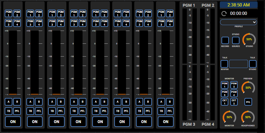
The console component can be used to create a control mechanism for a full console. After dropping this component onto a panel, use the control property to select from a list of consoles. When the panel with the component executes, it will automatically display and layout the controls according to the type of console it has been attached to. Increasing or decreasing the height of the component will adjust the height and size of the components within the console. Changing the width of the component will present or hide paging buttons for the fader list depending on how many faders the console has. The fader count is not correctly displayed in the designer and is fixed to 8. The fader list is only populated with the actual fader count when the console is initialized in a running panel.
Important Note: The Fusion and Powerstation require version 3.2.1.28 of the fusion software in order to properly use the monitoring section with this console component.
Console Fader Dock
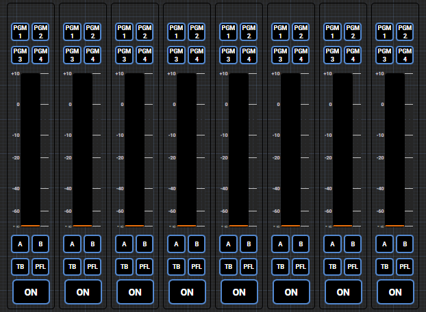
This component will present a list of consoles in the control property in the designer. When executing the panel connected to a console, the dock will auto-fill with all of the faders the console has. It will present page left and right buttons automatically if there are more faders than can be displayed in width designed in the console component.
Console Meters
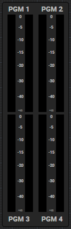
The console meters section presents metering for program busses 1 through 4. It will present a list of consoles through the control property in the designer that will allow you to map the control to a specific console. Like the updated console fader, it will automatically figure out the correct metering paths (lwrp/lwcpss) from the console it is attached to it. In addition this module has a logo property which will allow you to upload a logo image which will sit between the top and bottom meters. The size ratio of the logo must be designed in order to display correctly. The height should be approximately one fifth of the width. The example svg we have used had dimensions of 6774x1452 and is then scaled up and down accordingly. This may take some experimentation to get correct.
Router XY Matrix
The Router XY Matrix component shows a router as a grid of cross-points, like the XY tab of a router's details page.
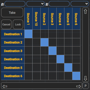
After adding the component to the page, resize it and select a router to use with it.
With the component selected, click the router property
In the Select Router dialog, click the desired router in the list and click Select
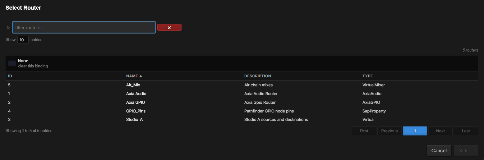
The component will not populate with actual router data while viewed in the Panel Designer. This means that the actual column and row header size may be inflated since the default designer example population only has ten sources and destinations. It is useful to view it in the actual executing Panel to see how it will function.
Action Properties
Property | Function |
|---|---|
trigger-take-clear | This property may be used by a Logic Flow and/or binding to remotely press the take/clear button. This will only have an effect if there is a cross point preset for action. |
trigger-lock | This property may be used by a Logic Flow and/or binding to remotely press the lock button. This will only have an effect if there is a cross point preset for action. |
trigger-cancel | This property may be used by a Logic Flow and/or binding to remotely press the cancel button. This will only have an effect if there is a cross point preset for action. |
set-preset | This property allows a Logic Flow to preset a cross-point. The syntax involves a string with the source and destination path with the X between the two. For example: tcp://172.16.1.97:93?l=SRC&d=src&i=2&t=aaudio X tcp://172.16.1.72:93?l=DST&d=dst&i=31&t=aaudio |
Events
Property | Function |
|---|---|
hover-source-name | Event raises the name of the source for the cross-point that the mouse is currently hovering over. |
hover-source-description | Event raises the description of the source for the cross-point that the mouse is currently hovering over. |
hover-source-path | Event raises the path of the source for the cross-point that the mouse is currently hovering over. |
hover-destination-name | Event raises the name of the destination for the cross-point that the mouse is currently hovering over. |
hover-destination-description | Event raises the description of the destination for the cross-point that the mouse is currently hovering over. |
hover-destination-path | Event raises the path of the destination for the cross-point that the mouse is currently hovering over. |
preset-source-name | Event raises the name of the source for the cross-point that has been preset. |
preset-source-description | Event raises the description of the source for the cross-point that has been preset. |
preset-source-path | Event raises the path of the source for the cross-point that has been preset. |
preset-destination-name | Event raises the name of the destination for the cross-point that has been preset. |
preset-destination-description | Event raises the description of the destination for the cross-point that has been preset. |
preset-destination-path | Event raises the path of the destination for the cross-point that has been preset. |
One of the interesting things you can do with the hover and preset events is to bind the path to the IO field of meters. This allows you to create a Panel where hovering over a cross-point also shows metering for that cross-point. Note that metering does not yet support IO binding to virtual router IOs.
Style Properties
Property | Function |
|---|---|
router | Used to select the router which will be used with the matrix. |
matrix-mode | How a click on a cross-point works. preset (the default): the click presets that one cross-point, and Take makes the route. multi-preset: each click adds a cross-point to (or removes it from) the preset list, and Take makes all of the routes. single: the click makes the route immediately, and the Take, Cancel and Lock buttons are hidden. |
destination-search-text, destination-device-search-text, source-search-text, source-device-search-text | The text in each search field. Set it so the matrix opens already filtered (--NONE-- leaves the field empty), or bind it to set or follow the search from a Logic Flow; it updates as the operator types. |
block-manual-search | When true, the search fields are disabled for the operator; they keep whatever the panel or a binding sets. |
touch-hover | When this option is set to true and the matrix is being used with a touch screen, the first tap will generate the same hover lines as you see when hovering a mouse over the cross-point. The second touch will preset. If this property is false, the first touch will both set the hover lines and set the preset. |
destination-search, destination-device-search, source-search, source-device-search | Each of these corresponds to whether that particular search field appears and is available in the search bar. Setting all of them to false will hide the search bar. This is particularly useful for small matrices where searching is not necessary. Please note that even if the device selection drop-down fields are set to true, they will still not appear for virtual routers. They will only appear if used with an audio or GPIO router. Virtual routers will display the textual search fields for both source and destination if they are enabled in this property. |
fixed-col-row-length | This defines the length of the row and column headers in pixels. |
row-height | Defines the height of the rows and columns in the grid. It is important to note that the grid will always be filled. Therefore, if there are not enough entries to fill the grid, these parameters may be larger than this height. Also, if you reduce this parameter you may find the grid extending off the bottom of the component. To correct this, reduce the font-size as well until it fits again. The sizing of items in the grid is a delicate balance so if you start altering these parameters from the defaults, you may have to tweak to get it to display correctly. The height is intentionally large enough for touch use. |
route-engaged-color | This is the color (blue by default) of cross-points where a route exists. |
route-preset-color | This is the color (dark red by default) of cross-points that have been preset for an action. |
route-hover-color | This is the color of the hover bars that show the row and column over which the mouse is hovered. |
grid-line-color | This is the color of the lines in the grid. |
disabled-button-text-color | This is the color of the text in disabled action buttons. |
enabled-button-text-color | This is the color of the text in enabled action buttons. This property is no longer used as the text color for enabled uses the specific button’s enabled color below. |
disabled-button-background-color | This is the background color of disabled buttons. |
enabled-button-background-color | This is the background color of enabled buttons. This is overridden by hover effects. |
locked-destination-background-color | This is the color of cross points that are locked. |
locked-destination-text-color | This is the color of the text in the row headers for destinations that are locked. |
matrix-scroll-bar-height | This is the height of the horizontal scroll bar and is also used as the width of the vertical scroll bar. Scroll bars will automatically disappear if all cross-points can fit on the matrix. |
matrix-search-bar-height | This is the height of the search bar. Please note that the correct way to hide the search bar is to disable the search field properties mentioned earlier in this property list. |
scroll-bar-color | This is the color of the active part of the scroll bars. |
scroll-bar-background-color | This is the color of the inactive (background) portion of the scroll bars. |
column-row-header-back-color | This is the background color of the row and column headers. |
column-row-text-color | This is the color of the text for column and row headers. |
route-hover-text-color | This is the color of the text for column and row headers when the hover/highlight selection bar is active on that row or column. |
cancel-enabled-button-color | This is the color used by the border and text when the cancel button is active as well as the background color of the cancel button if the button is enabled and the mouse is hovering or clicking on it. |
take-enabled-button-color | This is the color used by the border and text when the take/clear button is active as well as the background color of the take/clear button if the button is enabled and the mouse is hovering or clicking on it. |
lock-enabled-button-color | This is the color used by the border and text when the lock button is active as well as the background color of the lock button if the button is enabled and the mouse is hovering or clicking on it. |
preset-enabled-button-color | This is the color used by the border and text when the preset rotation button is active as well as the background color of the preset rotation button if the button is enabled and the mouse is hovering or clicking on it. |
disabled-button-border-color | This is the border color used by disabled action buttons. |
grid-offset | This is the number of pixels of offset between the edge of the matrix and the scroll bars. |
hover-event-timeout | This is the number of milliseconds that a cross-point must be hovered over before raising the hover events that may be used in Logic Flows. |
button-panel-background-color | This is the background color of the space around the Take and Clear buttons in the upper right corner of the matrix. |
Using the XY Matrix
Once a matrix has been added to a Panel, a router assigned to it, and the Panel saved, view the Panel to see how it functions.
Since this component mirrors the functionality of the XY matrix presented on the XY tab in Routers, refer to the Routers chapter for details on how the end-user can use the routing matrix once it is deployed on an HTML5 User Panel.
Gauge

A round gauge that shows a value as an arc and a percentage, as used for the level knobs in the console components. Bind its value to any numeric property.
Calendar Resource Display
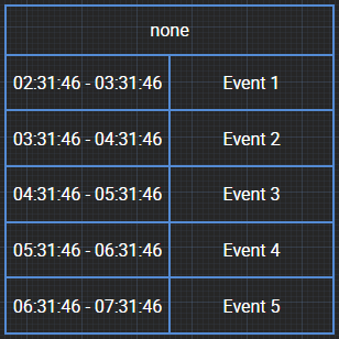
Shows the upcoming events of a scheduling resource as a list of times and event names, with the current event highlighted. Choose the resource, the number of events shown, the title bar and the colors in its properties. It needs the Scheduler license (see the Scheduling article). In the designer it shows sample events.
Analog Clock
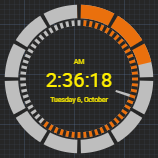
This component displays the current time using an analog clock style. The style may be changed using the --clockstyle property on the Style tab between quasar (shown above) and classic. --clock-source and --clock-timezone choose where the time comes from and which time zone it shows.
A variety of properties on the Style tab may be modified when the clock is in the quasar style in either light or dark theme so that you can adjust the colors to whatever you desire:
Property | Changes the color of |
|---|---|
hours-color | The outside circle. |
elapsed-hours-color | The elapsed hours in the outside circle. |
minutes-color | The inside circle. |
elapsed-minutes-color | The elapsed minutes in the inside circle. |
marker-color | The gaps between the marks in the hours and minutes circles. |
second-hand-color | The second hand. |
ampm-color | The AM/PM text. |
time-color | The time text. |
date-color | The date text. |
The classic style has its own set of color properties for the face, hands, marks and numbers.
Analog Countdown
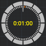
This component allows you to define and trigger a countdown. The clock will display the countdown value.
Custom properties include:
Property | Function |
|---|---|
countdownlength | The time in seconds for the countdown. |
countdownstart | Generally exposed via bindings for a Logic Flow to trigger the start of a countdown. Options are true or false. |
Elapsed Event | This event can be raised when the countdown timer completes. |
StopMode | This property defines what happens when countdownstart is set to false while the countdown is progressing. The options are: StopAndReset: stopping the timer by setting countdownstart to false will cause the timer to stop and be reset to the countdown value. Pause: stopping the timer by setting countdownstart to false will cause the timer to stop where it is in the countdown process and hold that value; setting countdownstart to true again will cause the countdown to continue from where it left off |
CountUp | Changing this value to True instead of False will cause the timer to count up rather than down to the selected countdownlength. If countdownlength is zero it will count up indefinitely until stopped and/or reset. |
Reset | This is an action property that can be used by Logic Flows and/or bindings to reset the counter. Setting it to true will cause the timer to reset. |
ResetMode | This property defines what happens when a reset is issued and a countdown is in progress. The options are: ResetAndStop: Setting reset to true will cause the timer to reset and stop its countdown. ResetAndContinue: If the timer is running this will cause it to reset and continue running. If the timer is stopped this will just reset the value |
ClockStyle | Changes the analog clock style of the countdown clock between classic and quasar in the same way as for the Analog Clock above |
Additionally, this component also has the same color styling properties when used in quasar mode as listed in the analog clock above.
Currently, the timer does not automatically reset when the countdown completes. If that functionality is desired, it can be obtained by using the property bindings to hook the elapsed event to the reset state such that when the timer elapses, reset is triggered. This can be accomplished either by using the Flow in elapsed to change the reset or by using the Flow in reset to change based on the elapsed start point.
In both cases, the Panel must be saved with the binding buttons for these properties/events turned on to surface those options in the Flow property tree.
For example:
Select the countdown, enable the bind button for its reset property, and in the Bindings drawer click the Start Point
Browse to the UserPanels group, locate the analog countdown control in your specific Panel, and select the elapsed Value property
Select True=True for the translation
Click Done. After saving the Panel if the countdown elapses the timer should automatically reset
Digital Clock
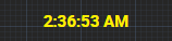
This component displays the current time using a digital clock style.
Digital Countdown
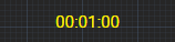
This component allows you to define and trigger a countdown. The clock will display the countdown value.
Custom properties include:
Property | Function |
|---|---|
countdownlength | The time in seconds for the countdown. |
countdownstart | Generally exposed via bindings for a Logic Flow to trigger the start of a countdown. Options are true or false. |
Elapsed Event | This event can be raised when the countdown timer completes. |
StopMode | This property defines what happens when countdownstart is set to false while the countdown is progressing. The options are: StopAndReset: stopping the timer by setting countdownstart to false will cause the timer to stop and be reset to the countdown value. Pause: stopping the timer by setting countdownstart to false will cause the timer to stop where it is in the countdown process and hold that value; setting countdownstart to true again will cause the countdown to continue from where it left off |
CountUp | Changing this value to True instead of False will cause the timer to count up rather than down to the selected countdownlength. If countdownlength is zero it will count up indefinitely until stopped and/or reset. |
Reset | This is an action property that can be used by Logic Flows and/or bindings to reset the counter. Setting it to true will cause the timer to reset. |
ResetMode | This property defines what happens when a reset is issued and a countdown is in progress. The options are: ResetAndStop: Setting reset to true will cause the timer to reset and stop its countdown. ResetAndContinue: If the timer is running this will cause it to reset and continue running. If the timer is stopped this will just reset the value. |
Currently, the timer does not automatically reset when the countdown completes. If that functionality is desired, it can be obtained by using the property bindings to hook the elapsed event to the reset state such that when the timer elapses reset is triggered. This can be accomplished either by using the Flow in elapsed to change the reset or by using the Flow in reset to change based on the elapsed start point.
In both cases, the Panel must be saved with the binding buttons for these properties/events turned on to surface those options in the Flow property tree.
For example:
Select the countdown, enable the bind button for its reset property, and in the Bindings drawer click the Start Point
Browse to the UserPanels group, locate the digital countdown control in your specific Panel, and select the elapsed Value property
Select True=True for the translation
Click Done. After saving the Panel if the countdown elapses the timer should automatically reset
List Selector
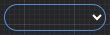
At this point in time, the list selector component should be used primarily by advanced users that understand the API. In a future version, we will add options for simplifying the selection of list content and data. This component provides a drop-down list for selecting elements in the system. For example, it could be used as a source selector for a router or a show profile selector for a console. Unfortunately, until we finish a more intuitive configuration user interface, some knowledge of the API and inner working of Pathfinder Core PRO are required to configure this component. A thorough understanding of SapV2 (see the SapV2 appendix) will help in the configuration of this component. Also, feel free to reach out to support for guidance.
There are 4 primary properties that are used together to describe the list options and another two for event and state:
Property | Description |
|---|---|
listsearchpath | This holds a SapV2 object path and optional property value for the root from which all objects in the list will be obtained; for example, |
listsearchdepth | The number of branches below the listsearchpath root to look for elements; many times, this will be 1 for one level deeper than the root selection, but it could be higher or -1 for infinite. |
itemdisplayproperty | This is the property that will be used as the display data for each object; this is what the user sees; this would likely be the Name property. |
itemselectproperty | This is the property whose value will be used in the change and current value events; for example the Id and/or ObjectId properties. |
currentvalue | This can be used by logic flows to select the displayed value. |
change (event) | This can be used to make a change when a different item in the drop down is selected; the value that will be available in the translation is defined by the itemselectproperty. |
Let’s work through two examples.
List Selector Example 1
For example 1 we will use the selector to present a list of sources from a router. When the user selects a different source, it will change a specific destination on that router. In this case, we will use GPIO_Pins, a router of Pathfinder Core PRO GPIO pins (router 4). Set the following property values:
listsearchpath:
Routers#0.SapPropertyRouter#4 SapObjectType=SapPropertySourcelistsearchdepth: 1
itemdisplayproperty: Name
itemselectproperty: Id
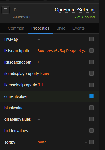
This means that we are looking for objects up to 1 level deep below the Routers#0.SapPropertyRouter#4 path whose SapObjectType=SapPropertySource. The last part of this is important so that the selector does not also show destinations. For each source that is found the selector will create an item in the select list whose display value is taken from the name property and whose select value is taken from the id property. This will display a list of sources by name from router 4 and the value used when a selection is made will be the source’s id. Use the Property Selector's API view to find the object path and object type of other routers (a virtual router, for example, is Routers#0.VirtualRouter#<id> with sources of type VirtualSource).
Next, enable the binding on the currentvalue and change properties. For the change event (on the Events tab) select the current source property of the destination, here Routers > GPIO_Pins > DST_127.0.0.1 001 Air GPO 1 > CurrentSource:
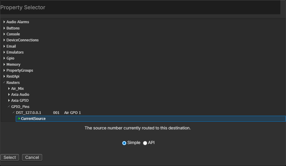
And use *=* for the translation. This will make sure that any time a new selection is made in the list, the number of that source will be passed to the destination’s currentsource property thereby affecting a route change.
For the currentvalue property, select the destination's current source again as the start point. Translation would again be *=*. This will ensure that if the destination route changes even by some other means that the drop down list will change to show the correct source:
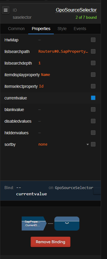
In this way, we have created a route selector from a drop-down list.

List Selector Example 2
In example 2 we will use the selector to present a list of show profiles for a qor/iq. When the user selects a different show profile for the qor/iq, it will change the show profile. Set the following property values (modifying for your own device):
listsearchpath:
Devices#0.Qor#[tcp://172.16.1.59:93].LwcpInterpreter#0.LwcpRoot#0.AppControl#0 ObjectName=ShowProfilelistsearchdepth: 1
itemdisplayproperty: Name
itemselectproperty: ObjectId
This means that we are looking for objects up to 1 level deep below the Devices#0.Qor#[tcp://172.16.1.59:93].LwcpInterpreter#0.LwcpRoot#0.AppControl#0 path whose ObjectName=ShowProfile. For each show profile that is found the selector will create an item in the select list whose display value is taken from the name property and whose select value is taken from the ObjectId property. This will display a list of show profiles by name from the Qor/iQ in question and the value used when a selection is made will be the show profile’s id.
Next enable the binding on the currentvalue and change properties. For the change property select the console’s appcontrol ShowProfId property. And use *=* for the translation. This will make sure that any time a new selection is made in the list, the number of that show profile will be passed to the console’s showprofid property thereby affecting a show profile change.
For the currentvalue property, select showprofid property again as the start point. Again use *=* for the translation. This will ensure that if the show profile changes even by some other means, that the drop-down list will change to show the correct show profile.
In this way we have created a drop-down list for selecting a new show profile.
We realize that until more intuitive user configuration user interfaces are created, this component may be challenging. If you need to understand how to use it for a specific task, please reach out to support and realize that currently this is an advanced feature and may require some time for them to obtain the correct parameters for your task.
In addition to the primary properties discussed above which are required to make the list selector work properly, there are several additional properties that require explanation:
blankvalue
Each item in the list has a display value obtained from the display property and an actual value that gets used when the item is selected obtained from the itemselectproperty. If the current actual value is blank, there may not be an item in the list which matches a blank value. This allows you to define a value to use in the list selection if the current value is blank. For example, when using a virtual destination list, the none route source may return a currentsource value of blank rather than zero. The id value for the none source is zero. By entering 0 in this field, the 0 value will be used when selecting the current item in the list whenever a blank value is returned from the system. Without this setting, the list might display the last known selection rather than none.
disabledvalues
This field can accept a comma delimited list of values which if they exist in the list will display in the drop down list but be disabled and unselectable. Use the value from the itemselect property in this list not the display value. For example if the drop down list was showing the virtual sources of a virtual router, using an entry of -3,-1 would make the Other and Previous sources disabled.
hiddenvalues
This field works exactly the same as disabledvalues except it will hide the entries presented in the comma delimited list.
sortby
This option allows you to sort the items in the drop-down list by the original inbound order (none), alphabetically by value (value), or alphabetically by the display name (name).
option-background-color (Style tab)
This allows you to define the background color of the drop-down menu that pops up when you try to select a new item.
option-color (Style tab)
This allows you to define the font color of the items in the drop-down menu that pops up when you try to select a new item.
Hardware Mapping Buttons
HTML or Console Buttons may be mapped to physical LCD buttons in the console or rack mount button panels. Hardware mapping makes the physical button mirror the behavior of the software button. To define this:
Click on a User Panel Button and click the hwmap field
The Select Hardware Button dialog will appear listing the known hardware buttons in the system
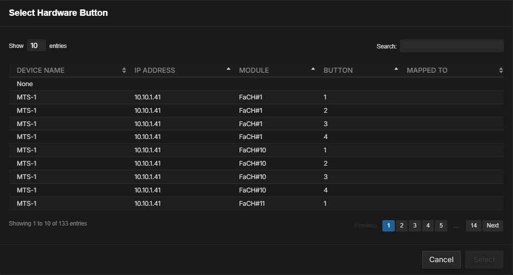
The Mapped To field will display a value if the button has already been hardware mapped as each hardware button can only be mapped to a single software button. Physical buttons do not have to be hardware mapped. They can also just be used directly with Logic Flows
If the button you want is not shown, make sure the LCD Panel or console is in the devices list. If not, it needs to be discovered. See the Discovery topic in Chapter 1 for more details on discovering devices.
LCD Panels must be manually discovered in devices using the add and Lwcp discovery. If a console device exists in the system but is not showing the LCD buttons, try pressing a few of the LCD buttons and then refreshing the web page.
Select the button you want to hardware map and click Select
Important Note: Once the Panel is saved, hardware mapping in HTML Panels takes place natively in the application and does not require hardware map Logic Flows as the legacy Panels did.
Once a button is mapped, only the properties that apply to that kind of hardware button are offered. The hardware button follows the software button's colors, including its disabled colors. A button's aliases share its hardware mapping.
Button Indicator PULSE Values
PULSE_0 through PULSE_10000 will flash an HTML or Console Button for the specified number of milliseconds (PULSE_[ms]) and then return to the last requested state. If the indicator state is changed while the pulse flash is in progress the new state will be returned once the flash time is complete. PULSE_0 may be used to cancel an in-progress pulse. This allows the easy binding of state (ON/OFF) conditions while allowing an additional Flow to control flashing.
For example, if we want GPI 1 to cause a button to flash for 5 seconds and then turn on or off depending on the state of GPI 2, PULSE lets us do this with two simple Flows:
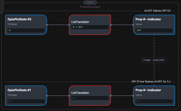
This type of Flow is useful for situations where you need to flash a button as an alert but retain a known state after the flashing is complete.
In this case, the button indication is tied to the GPI 2 state but setting GPI 1 to Low will cause a 5000ms (5-second) flash (PULSE_5000). It will then return to whatever state GPI 2 is currently in even if that state has changed during the duration of the pulse.
If the button is an HTML5 button this can be made even simpler by binding the indicator to the GPI 2 state within the User Panel and only implementing the PULSE (flash) flow in Logic Flows.
User Panel Advanced Options
The User Panels group in System > Configuration > Advanced Options holds these options:
Option | Description |
|---|---|
DefaultTheme | The theme for new panels in the classic panel designer. The 2.0 Panel Designer always starts new panels on the dark theme; change it on the page's Style tab (see Selecting a Theme). |
AlphaFilter | How strongly a disabled button's colors are faded, from 0 to 1, when UseAlphaFilter or UseAlphaFilterSA is on. |
UseAlphaFilter | When True, a disabled Button's colors are derived from its normal colors using AlphaFilter, and its disabled color properties are not shown in the Inspector. |
UseAlphaFilterSA | The same for Console Buttons. |
ShowHelpMessages | Help messages in the classic panel designer. |
A reboot is required before any advanced setting takes effect.
It is also important to note that the theme just presents you with the default styling of the components. All properties for customizing that style to your own liking and design are still available in both themes.
Changing Pages
Creating additional pages is described in Pages. In this section, we will explore how to switch between panels and pages. Switching between multiple Pages can be accomplished by using the ChangePage property. Let’s build an example set of linked pages. This example will create a map with an alarm state that can be clicked to obtain more details on the alarm from a second page.
Create a new Panel and click Save. Name the Panel Example_Map.
Click an empty part of the page to select it. On the Inspector's Style tab, click the background-image property:
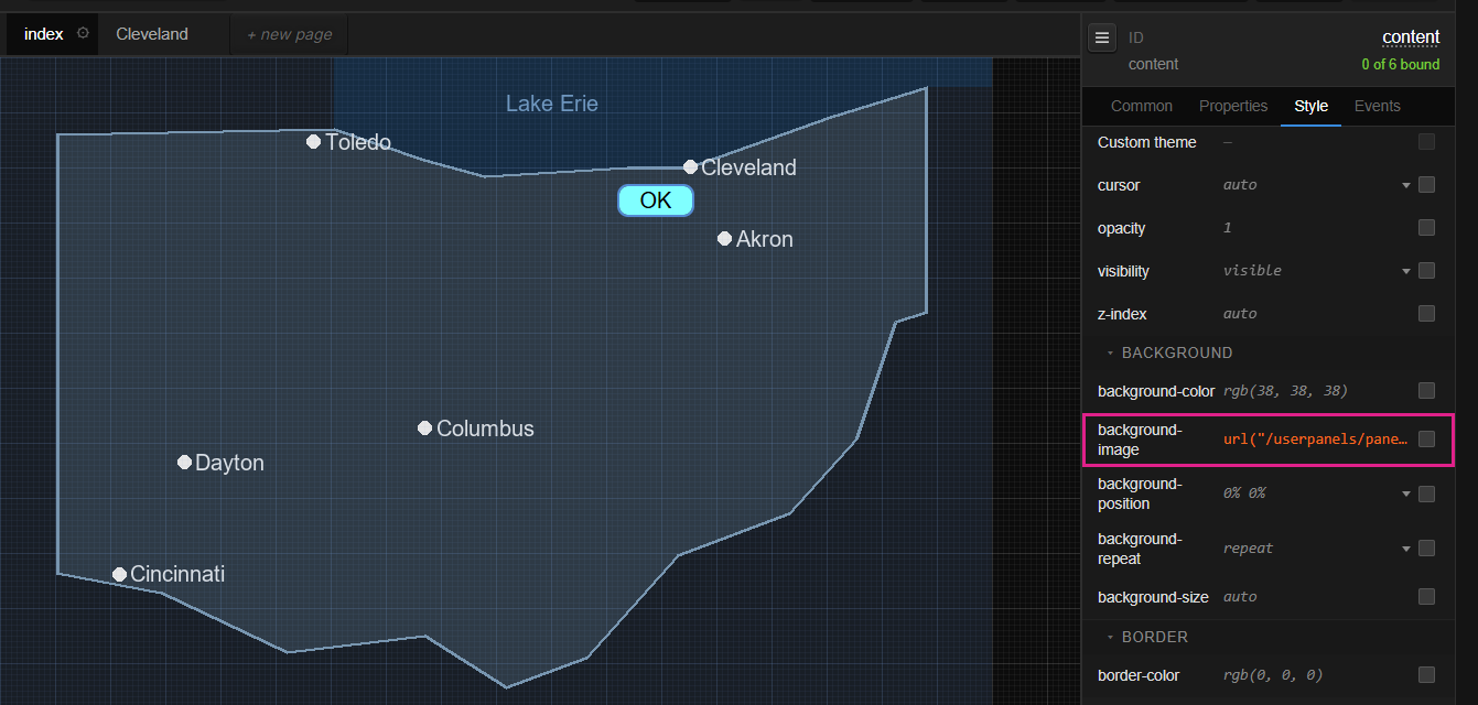
The Select Image dialog will appear for selecting and uploading images. For this example, we will upload an image of a map of Ohio; click Choose File and select your stored image; the image will appear in the selection list. Click on the image and click Select; the background of the Panel will now display the image of Ohio.
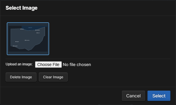
Drag a button into the Panel and position it next to Cleveland. Rename it ClevelandStatus (click its ID at the top of the Inspector), then modify the button’s properties:
Tab | Property | Value |
|---|---|---|
Properties | caption | OK |
Properties | width | 70px |
Style | backcoloroff | #80FFFF |
Style | textcoloroff | #000000 |
Style | opacity | 0.8 |
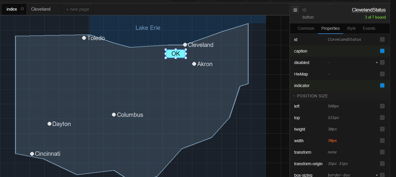
Rename a control before you change its other properties. Renaming it afterwards can lose those changes.
Enable the binding for the indicator state of the button. In the Bindings drawer, click Click to choose a binding target, and select a SilenceAlarm AlarmState (Audio Alarms > SilenceAlarm#AirChain > AlarmState):
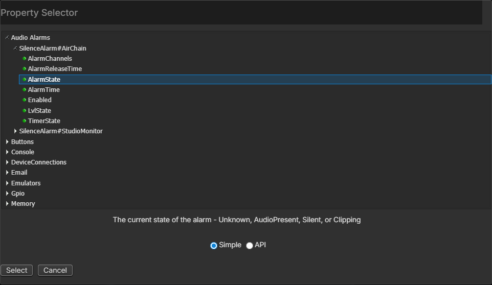
For the Translation, select AudioPresent as indicator OFF and Silent as ON, then click Done:
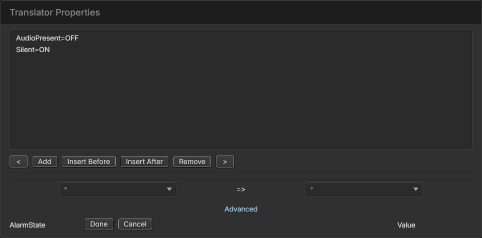
When the system asks about the mouse down action, click No; in this case, the mouse down is going to change pages and has nothing to do with the property we are picking for the indicator so we will set it separately. The drawer now shows the indicator's flow:
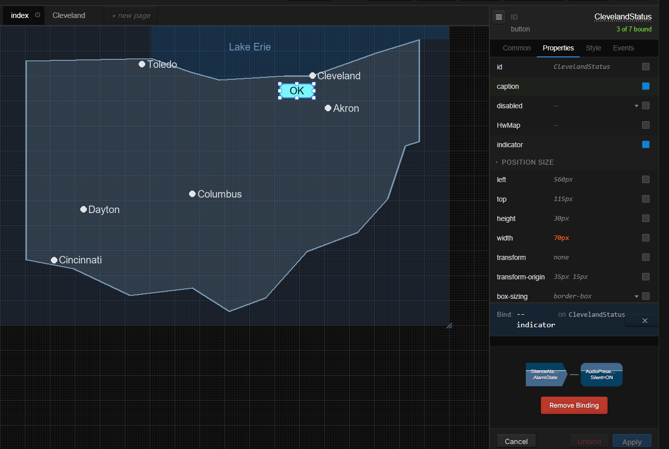
Turn on the binding for the caption property and select the same AlarmState property. For the Translation make Silent convert to Err and AudioPresent to OK. Type a value that is not in the drop-down into the box on the right. Click Done, and No to the question about the mouse down action.
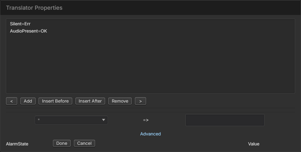
Save the Panel; at this point, if we were to execute this Panel, the button next to Cleveland should be cyan and OK if the silence alarm has audio presence, and Err and Red if it is silent:
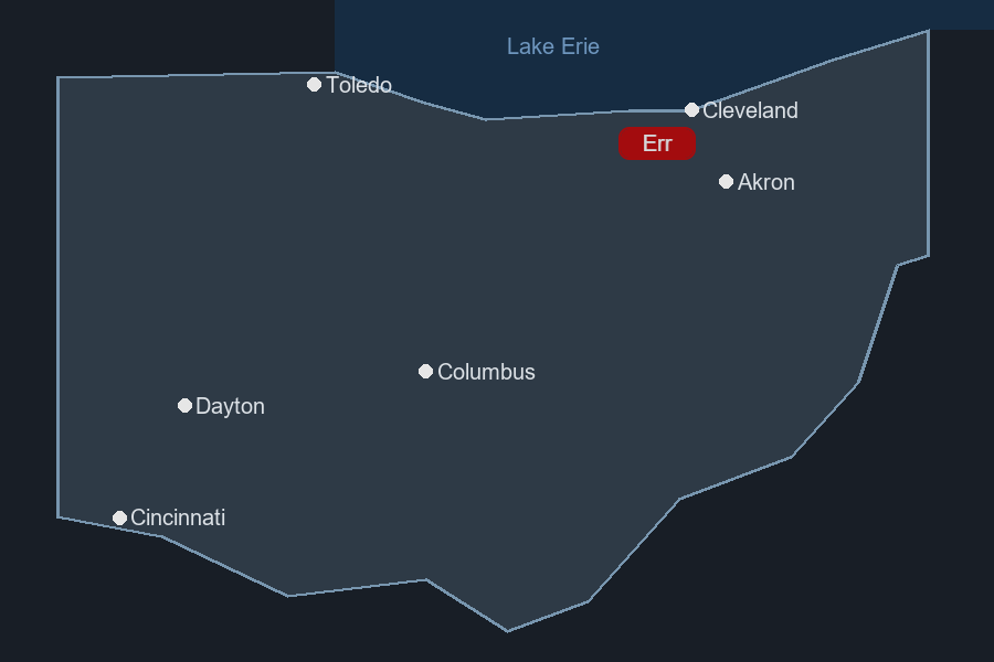
Click + new page, name the new page Cleveland, choose Blank page and click Create. A new blank page takes on the index page's background; clear it with Clear Image in the background-image dialog if you want a plain page.
Drag a new button onto the new page, rename it ReturnButton, and set its caption to Return.
With the button still selected, enable the mouse down binding on the Events tab. For the End Point, expand the UserPanels section of the Logic Flow property selector, expand UserPanel#Example_Map > Example_Map.Cleveland and select the ChangePage property.
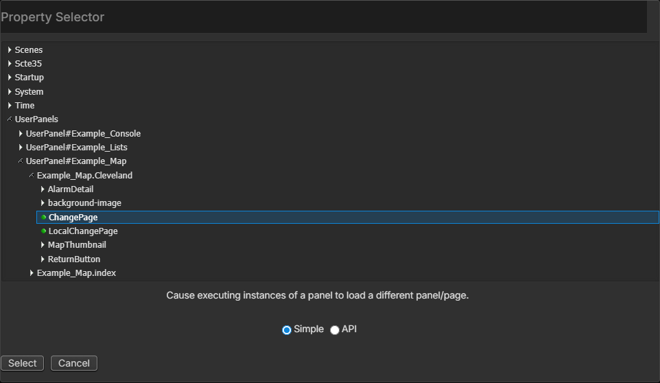
Note: If you do not see Example_Map.Cleveland in the Logic Flow property selector, it means you have not yet saved the new page.
In the translation set True=Example_Map.index and click Done.
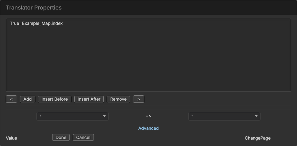
Click No when asked about updating the button color properties, and save the Page. We have just defined that when we click the return button on the Cleveland page it will set the ChangePage property of the Cleveland page to Example_Map.index, effectively returning to the index page.
Click the index tab to select the index page again. Click the ClevelandStatus button to select it and turn on the binding for the mouse down event on the Events tab. Select the UserPanels > UserPanel#Example_Map > Example_Map.index ChangePage property, and in the Translation set True=Example_Map.Cleveland then click Done.
Click No for the binding button color question and save the Panel.
Launch the Panel; the button on the main map should switch caption and color based on the silence alarm state; clicking the OK button should take you to a new Page called Cleveland, while clicking the return button should take you back to the main map index page. Here the Cleveland page also has a label bound to the same alarm state and an Image control showing the map:
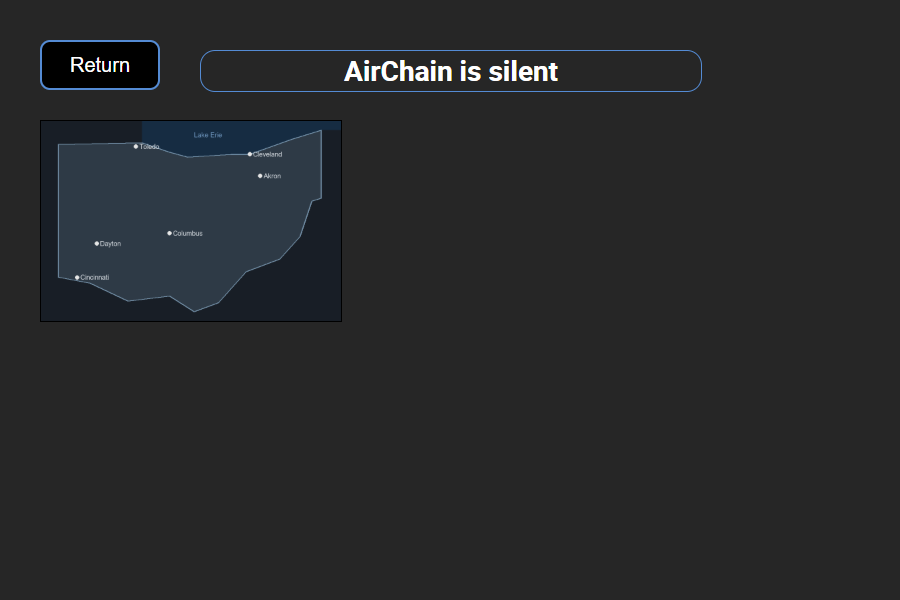
You are always selecting the changepage property of the current page and defining the Page you want to move to in the button’s translation dialog.
ChangePage changes the page in every running copy of the panel. Each page also has LocalChangePage, which changes the page only in the browser where the button was pressed; use it when several people use the same panel and each should be able to move between pages on their own.
Another interesting point is that the changepage property is also available to normal Logic Flows. For example, rather than binding this to the mousedown event, we could create a flow in Logic Flows that automatically switches the Panel page to the Cleveland Panel whenever a silence alarm occurs and back again when audio presence is restored. Additionally, the changepage property is not limited to pages within the same Panel. You could switch to a completely different Panel.
In a real use case, we would fill the Cleveland page with more information than just a return button. For example, we might create a system flow chart page with meters and buttons and silence alarm states of various parts of the chain to more easily determine where the failure occurred.
SubPanels
HTML5 Panels include an Iframe component which is essentially an HTML5 iframe that can be used to embed other web pages and components (for example from a corporate page or video link) into a Panel. It can also be used to embed a different Panel into a parent Panel. For example:
Create a panel named Example_Shared with two pages: index, with an Analog Clock, and alarms, with two labels showing the state of two silence alarms.
Create a new Panel. Save the Panel and name it Example_SubPanels. Drag two buttons into your new Panel, named ClockButton and AlarmsButton with the captions Clock and Alarms, and set their backcoloron and backcoloroff colors.
Drag in an Iframe component and enable the binding on the src property of the Iframe component (on the Properties tab). Save the Panel, so that src appears in the Property Selector.
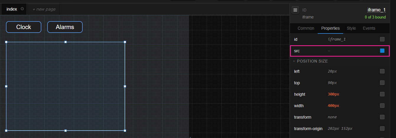
Click ClockButton to select it, and enable the binding for mousedown on the Events tab. Select the iframe src property as the endpoint: UserPanels > UserPanel#Example_SubPanels > Example_SubPanels.index > iframe_1 > src > Value.
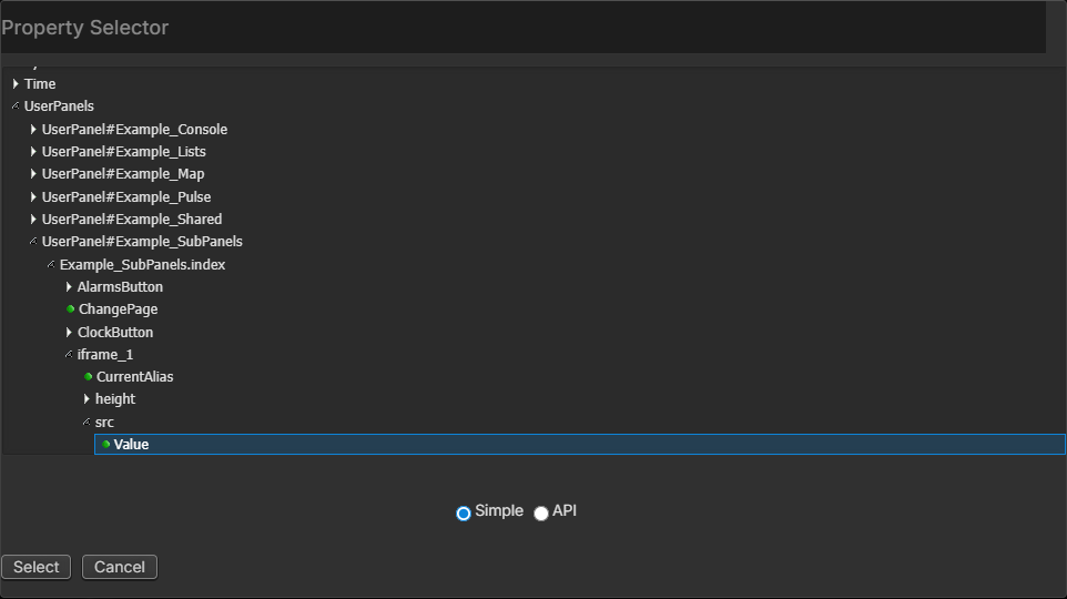
For the translation make the mousedown true equal to:
/userpanelframemin.php?panel=Example_Shared&page=indexReplacing the Panel name (Example_Shared) and page name (index) with the name of the Panel and page you wish to display as a subPanel.
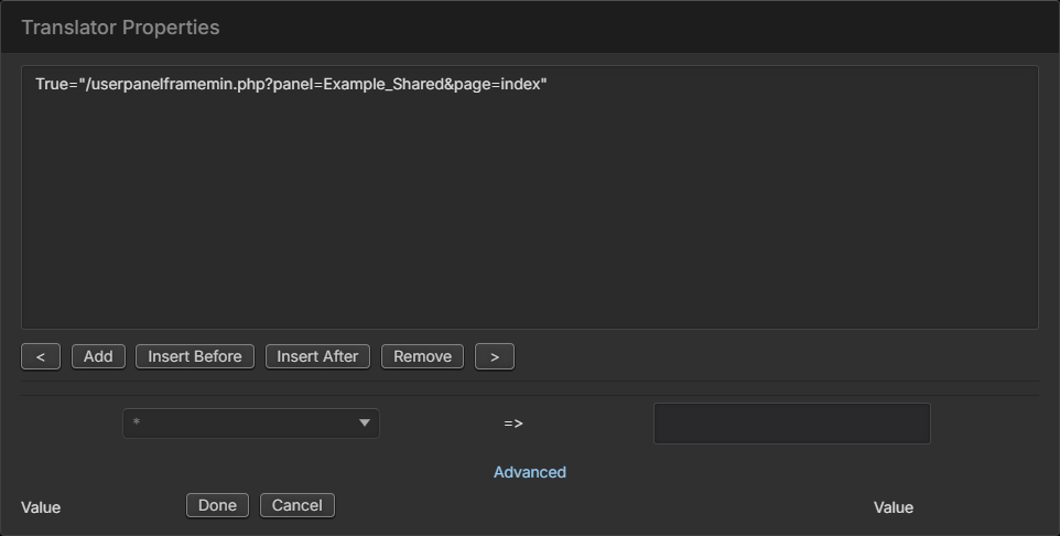
It is important to use the userpanelframemin.php page rather than the userpanelframe.php page so that the full Pathfinder Core PRO header and menu system do not appear in the subPanel.
Click Done and click Yes to allow the reverse binding to be set up so the indicator will light when the selected page is loaded in the iframe:
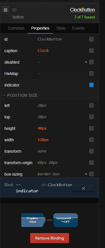
Repeat the procedure for AlarmsButton, referencing a different page in your Translator statement (
page=alarms).Save your Panel.
When the main Panel is executed, the Iframe component will load with the Panels specified by your buttons as subPanels. In this way we can create shared content that can be loaded in multiple Panels as shown below:
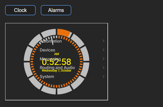
SubPanel and shared content problems
The example above works great for many kinds of shared content. For example, we could create a Panel for each studio where one of the selection buttons loads a clock and meter subPanel, and another loads an airchain display subPanel.
The challenge comes when the shared subPanel needs to target different things depending on the parent Panel.
For example, what if the subPanel buttons in the examples above were source selectors but needed to target a different destination depending on whether they were loaded in Studio 1’s parent Panel or Studio 2’s? The subPanel could be a specific and even paged set of selections common across all studios, but would need to target the fader on whichever studio the subPanel was loaded in.
The temptation to solve this problem would be to create some sort of Logic Flow that changes what happens depending on which Panel last loaded the subPanel (Studio 1, 2, etc.) However, this approach does not allow for the subPanel to be loaded in both at the same time. Also, the subPanel itself has no knowledge that it is loaded as a subcomponent of another Panel.
The only way to solve this problem is to introduce messaging internal to a given instance of a browser, allowing the subPanel to communicate with the parent Panel instead of with a specific destination and vice versa. That kind of messaging is the purpose of the Panel SetLocal and the Local Panel Memory Slot.
Panel SetLocal
Important Note: This is considered an advanced feature and is often used in tandem with the Local Panel Memory Slot feature.
Each HTML5 Panel page includes a write only property called SetLocal. This property sends messages to set another property on the running instance of the Panel, its parent, or a subPanel. Like the Local Panel Memory Slot, this property operates inside a single, specific instance of a Panel rather than upon all running instances of a given Panel.
In version 2.0 the Panel Designer does not show the page's setlocal property, so it cannot be bound in new panels. Panels that already bind it, for example panels built in version 1.x, keep working.
In general, this property’s value will not be set in the Panel designer. Instead, the binding will be enabled and then can be used or bound to other items in the Panel via the Panel’s internal flows. The syntax that makes this possible is:
<target>|<elementId>|<propertyName>=<PropertyValue>
For example, you could enable the binding of this property and then when a button is pressed you can set the value of this property to:
iframe_1|MyButton|Indicator=ON
The target portion can either be:
parent = assumes this Panel is loaded as a webbrowser (iframe) subPanel of another Panel and we wish to send a property change to the parent Panel.
local = tries to set a property on the local instance of the Panel.
name of a web browser (iframe) element in the form = tries to set a property on an element in a Panel running in a web browser element in the existing Panel. This variation looks for an iframe in the current Panel of the correct name and then passes the property message to the web page running in that iframe.
Examples:
parent|MyButton|Indicator=ONattempts to turn the Indicator property On for a Button named MyButton that is expected to reside on a Panel in which this Panel is running as a subPanel.local|MyButton|Indicator=ONattempts to turn the indicator property On for a button named MyButton that is expected to reside on this instance of the Panel.iframe_1|MyButton|Indicator=ONattempts to turn the indicator property On for a button named MyButton that is expected to reside on a Panel loaded in a web browser (Iframe) element called iframe_1.
It is important to understand that SetLocal sets properties only in this instance of the browser.
If you have the Studio 1 Panel loaded on two different computers and you perform an action that uses the SetLocal property to change an element’s property, that change will only happen on that computer’s instance of the Panel unless other external bindings are also in use.
If the change is bound to a component inside the Panel it will remain inside that instance of the Panel, but if it is bound to something like a route change that is outside of the Panel it will likely happen on all. This can be seen because using this property as a binding to a component inside the Panel will not generate a Panel based Logic Flow and binding it to something outside the Panel will. The nuances of this are a bit subtle but should become clear as we work through the example below.
Panel Memory Slots
Important Note: This is considered an advanced feature and is often used in tandem with the Panel SetLocal feature.
Panel Memory Slots are like normal memory slots except that they only live inside a browser instance of a Panel. They can be thought of as a javascript variable that also raises a change event inside the running instance of the Panel.
The item can be found in the Memory group of the Controls palette as Local Panel Memory Slot. Dragging it onto a Panel will create a dotted component. This component will be invisible when the Panel is actually executing. The Panel Memory slot has three important properties/events in the Inspector:

Property | Notes |
|---|---|
panelmemoryslotvalue | The value of the Panel memory slot. |
raisetoserver | Used to determine whether change events are raised only inside the local instance of the Panel or also to the server. |
panelmemoryslotchange | An event that fires when the value changes. This event carries the new value rather than just a true or false as its data. |
The Inspector shows the first two with leading dashes, as --panelmemoryslotvalue and --raisetoserver.
Like the SetLocal property above, if this is bound using a Panel Flow to an item inside the Panel (button, iframe, etc), no flow in the larger Pathfinder will be created. Instead the value will just be changed or affect change within the running instance of the Panel only. If the Flow is bound to an item outside the Panel (for example a route change or console fader state), then a Flow will be created.
Shared SubPanel Example
Returning to our example above: what if the buttons in the SubPanel are tied to sources on destinations dependent on which studio’s parent Panel the subPanel is loaded in? To accomplish this, we are going to use three Panel Memory Slots: two in the Studio1 parent Panel, and one in the SubPanel. Our configuration might look like this:
Studio1 Panel
In addition to general Panel settings, we need to create two Panel Memory Slots: currentsource and selectsource.
Memory slot: currentsource
This memory slot will pass the currentsource value of a virtual router destination to a specific subpanel instance. This is accomplished using these bindings:
panelmemoryslotvalue will be bound to the currentsource property of a virtual router destination using a Panel flow and a translation like this:
*=*. This means whenever the currentsource property of that virtual router destination changes, the currentsource value will be assigned to this memory slot.panelmemoryslotchange will be bound to the setlocal property of the Studio1 Panel using a translation like this:
*=iframe_1|currentsource|panelmemoryslotvalue=*. This means whenever the currentsource value changes, it will attempt to also set the same value on whatever Panel is running in the subPanel loaded to iframe_1.
Memory slot: selectsource
This memory slot will change the route on the destination whenever its value changes.
panelmemoryslotchange will be tied to the same virtual router destination’s current source property.
raisetoserver needs to be set to true.
General Settings
setlocal needs to be enabled.
Shared SubPanel – page 1
In this shared SubPanel, in addition to general Panel settings, we need to create one Panel Memory Slot: currentsource.
Memory slot: currentsource
This memory slot will receive and match the current source from the parent’s currentsource panelmemoryslotchange change event. This is accomplished using these bindings:
panelmemoryslotvalue must be enabled.
panelmemoryslotchange must be enabled.
General Settings
setlocal needs to be enabled.
We will bind each of the button indicators to the value of currentsource with a translation like
1=Onand*=Off, where 1 is the source whose button indicator we want to light. When the Panel is running, this will cause the subPanel to light the correct button depending on which source number has been fed to it from the parent.Last we will bind the button press to the Shared Panel’s setlocal property with a translation that looks like
True=parent|selectsource|panelmemoryslotvalue=1, where 1 is the source whose button has been pressed. This will allow the button press to pass the source selected to the parent Panel’s selectsource memory slot. Which if we remember is bound via its change event to the actual destination’s currentsource.
The interesting part of the steps above is that we can now clone Panel 1 to Panel 2. In Panel 2 we change the bindings on currentsource and selectsource to a different destination for Studio2. And we make sure that the Panel selection buttons point to studio 2’s iframe rather than studio 1’s. But the shared Panel does not need any changes. It will just start working for studio 2 and studio 2’s destination. More importantly if we need to add functionality to the shared component it will work for both studios.
The key thought process that needs to be utilized is that if the shared content manipulates something specific then none of these steps are necessary. But if the shared content needs to manipulate something different depending on the parent Panel it is loaded in, then we need to pass messaging between the internal Panel and the parent to accomplish that.
This is one example of how these features may be used. It could be expanded greatly. For example, the src property of the iframe could be assigned using a setlocal so that it does not need to be updated for each studio page. Or we could add additional Panel memory slots for manipulating other destinations or even dynamically selecting the destination at the parent level.
Additionally, there are future features planned for embedded routing components that may make this specific example less necessary. However, even if we add such components there will always be situations that are custom and do not work with our preconceived components.
It should also be pointed out that in many situations it is probably simpler, easier, and more understandable to just clone. Because this is a more advanced feature it is also more advanced to understand. However, for the times when the embedded content is duplicated in too many places and needs to be periodically changed, this allows for that kind of reuse.
Important Note: to see a video presentation of the functionality described above visit this link: http://pathfinderpc.com/pfcorepro_downloads/reusablesubpanels.mp4
Legacy User Panels
Prior to Pathfinder Core PRO’s HTML 5 Panels, User Panels could be created using a variation of PanelDesigner from the original Pathfinder PRO product. As this functionality is deprecated, we would urge all users to migrate to the much more powerful HTML5 Panels.
The Panels created in the original Pathfinder PRO are called Legacy User Panels and are not interoperable with the new HTML 5 Panels. For example, you cannot open an HTML5 Panel in PathfinderPC/Mini and you cannot open a Legacy User Panel in a web browser.